Minimal Calender
I analyzed the existing Minimal Calendar app to identify usability gaps and pain points. Based on these insights, I developed an improved version that enhances functionality while staying true to the original brand’s minimalist aesthetic and visual identity.
-
Despite its clean look, the original Minimal Calendar app lacks key features and intuitive interactions, which limits its usefulness for daily planning.
-
Design-conscious users who value simplicity but still need a calendar app that supports efficient, everyday scheduling.
-
Improve functionality and usability without compromising the brand’s minimalist design language.
Pain Points
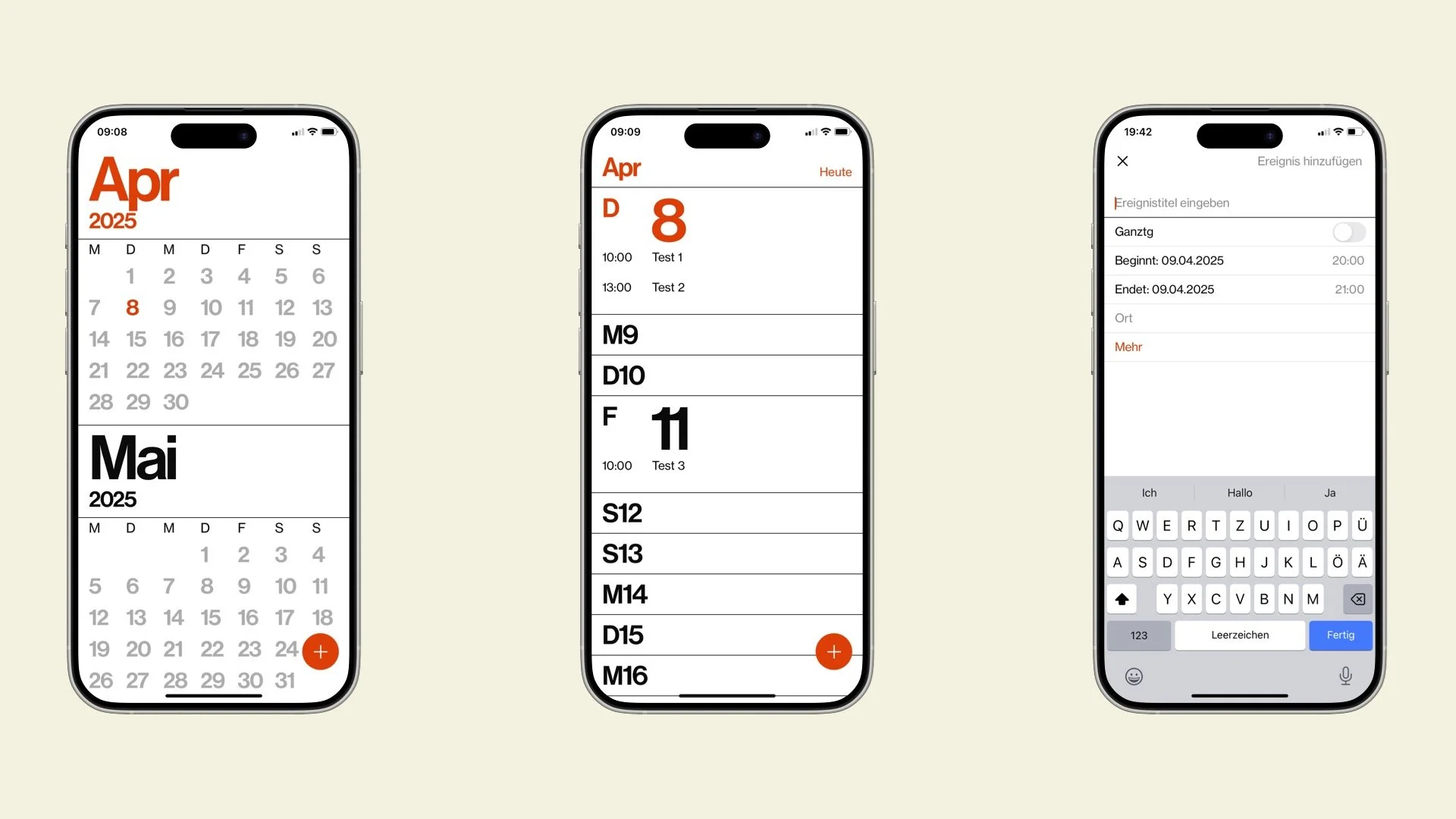
The app’s use of single-letter weekday abbreviations leads to confusion — for example, Saturday and Sunday both appear as “S.” There’s no quick overview of the day’s events, the monthly view lacks clarity and the process of adding a new event feels unnecessarily complicated.
High-Fidelity Wireframes

The improved home screen offers a quick overview of upcoming events for the day, while the redesigned monthly view enhances structure and readability. Additionally, the event creation form has been streamlined to make adding new appointments faster and more intuitive.