
A self-reflection app that helps users reconnect with themselves in the chaos of everyday life.
-
As part of the UX/UI Design Bootcamp, I developed an app designed to promote self-connection. The goal was to create a digital solution that encourages users to engage in self-reflection in a low-threshold and accessible way.
-
In the fast-paced routines of daily life, many people feel stressed and disconnected from themselves. Although the need for self-connection is strong, it is often difficult to make time for it. What’s missing is a simple, flexible companion that gently encourages self-reflection—without pressure, in a personal and practical way that fits into everyday life.
-
I assume that regular self-reflection has many benefits—for example, gaining a clearer understanding of one’s needs and emotions. In turn, this can lead to greater long-term self-satisfaction. However, I also believe that many people simply don’t know how to cultivate this self-connection in the first place.
UX Research
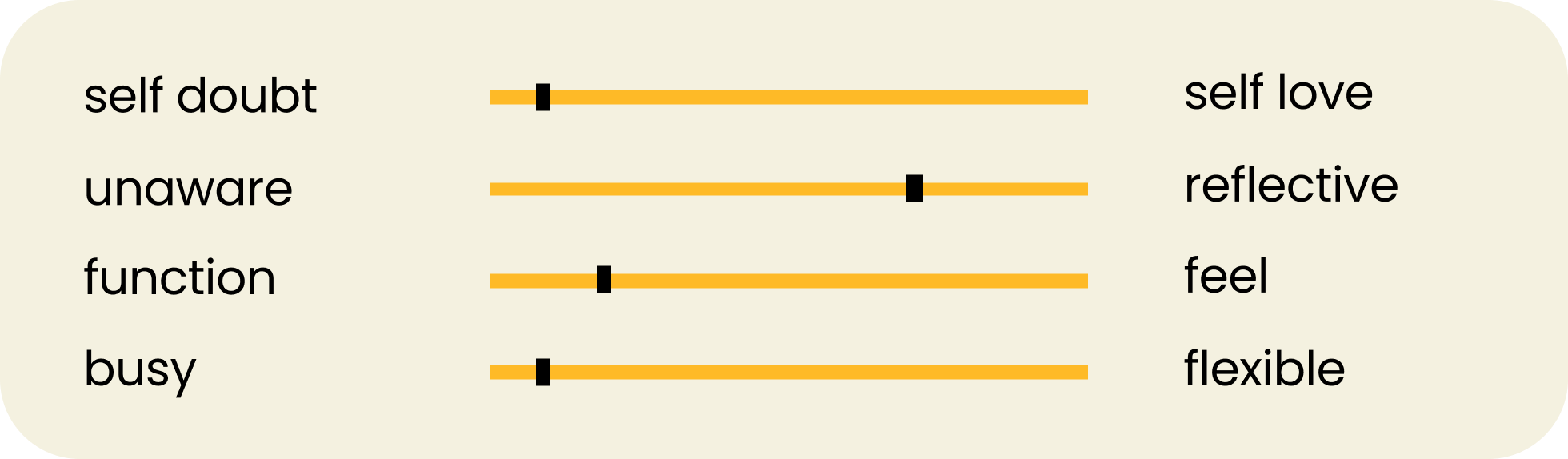
To explore how self-doubt and the need for self-connection shape users’ lives, I conducted a mixed-method study combining quantitative and qualitative approaches.
An online survey with 144 participants revealed key insights into habits, needs, and challenges. To deepen my understanding, I conducted two user interviews and spoke with a psychotherapist to gain expert psychological context.


How Might We?

How might we support people in using digital self-reflection in their daily lives so that…
it strengthens their self-connection and autonomy…
while also making long-term progress visible to boost motivation and persistence?
User Persona

As a reflective yet stressed mother, I often feel overwhelmed in daily life and therefore wish for practical support to reconnect with myself, so I can regain strength.
“
User Journey
UI Foundation
-
numi stands for "Nur ich mit mir" in German or in English "(k)now me”. The connected letters symbolize (self-)connection, while the rounded shapes create a modern and inviting feel.
-
numi relies on modern, vibrant colors — creating a powerful look that reflects clarity and empowerment.
-
For headlines numi uses Poppins — modern and clear, matching the logo. Lato is used for body text — highly readable, friendly, and structured.
-
For numi I illustrated two symbolic motifs: shells and hands. The app characters are shells — symbolizing protection, inner beauty, journey, and transformation. The hand motifs represent actively shaping one’s own path.
Wireframes
High-Fidelity Screens
Prototype